
Ask These 5 Supplier Questions Before UK Gift Box Branding Orders
Gift box branding is the combination of box format, material and finishing that shapes how your brand feels the moment someone lifts the lid. Three choices decide the outcome: the construction format, the substrate, and the finish. Get a golden sample from your supplier before committing to a bulk run, so you approve the actual colour, texture and fit rather than a digital proof.
TL;DR:
Rigid lid-and-base boxes are best for luxury gifts but come with higher tooling costs, making them suitable for small, high-value orders.
Recycled kraft materials and mono-material designs are increasingly popular for eco-friendly packaging with lower environmental impact and easier recyclability.
Finishing techniques like foil stamping or debossing require physical tooling, which adds cost but enhances perceived quality, especially on coated surfaces.
Providing vector logo files, Pantone references, and dieline checks ensures accurate reproduction and reduces delays or reprints.
Lead times typically range from one to two weeks for samples and longer for bulk production, with minimum order quantities rising alongside construction complexity.
Table of Contents
How long do gift box orders take, and what are typical minimums?
What does the evidence say about sustainable design trade-offs?
What design principles actually make gift box branding work?
Our approach at Say Hey Gifting: branded boxes without the guesswork
How Say Hey Gifting turns a branding brief into a finished box
What formats work best for gift box branding?
The format you choose sets the tone before a single logo goes on the lid. A heavy rigid box says something different to a recipient than a flat-packed mailer, and the two serve very different jobs.
Rigid lid-and-base boxes feel substantial the second they’re picked up, which makes them the default choice for luxury hand-delivered gifts, client hampers and anything meant to signal real investment. Collapsible rigid boxes offer that same premium wall thickness but fold flat for storage and shipping, cutting freight costs without sacrificing much presentation. Magnetic closure boxes add a satisfying click on opening, a small tactile detail that recipients remember, and they work well for retail-style unboxing moments. Drawer boxes slide open like a jewellery case, ideal when the product inside deserves a slow reveal. Folding cartons are lighter and cheaper, suited to bulk promotional kits or press packs where volume matters more than heft. Mailer boxes are engineered to survive Royal Mail and courier transit, making them the natural pick for letterbox gifts sent direct to employees’ homes.
Suppliers commonly frame rigid construction as the format that conveys premium value, while collapsible and folding options exist to bring shipping costs down without losing brand presence, according to supplier guidance on custom gift boxes. That trade-off between weight and cost runs through every format decision.
Rigid lid-and-base: highest perceived value, higher tooling cost, best for client and VIP gifts
Collapsible rigid: near-rigid feel, flat-pack shipping, good for large corporate runs
Magnetic closure: strong unboxing impact, mid-range cost, suits retail-style gifting
Drawer box: distinctive reveal, moderate cost, works for smaller premium items
Folding carton: lowest cost, faster turnaround, best for bulk kits and press packs
Mailer box: built for transit, ideal for letterbox and direct-to-home gifting
Minimum order quantities generally rise with construction complexity. A folding carton might run at a few hundred units, while rigid boxes with bespoke tooling often need larger runs to justify the setup.
Which materials and sustainability options matter?
Greyboard is the sturdy core used inside most rigid boxes, wrapped in printed paper or fabric to create the outer finish. Recycled kraft gives a warmer, more tactile look straight out of the box, with no wrap needed, and it has become one of the fastest-growing choices as buyers push for lower-impact packaging. Folding carton stock is thinner and cheaper, printed directly rather than wrapped, and suits high-volume promotional runs. Coverings then layer on top: soft-touch lamination for a velvety feel, matte lamination for understated premium, or uncoated kraft left bare for an honest, recyclable finish.
Sustainability claims are only worth making if they’re checkable. Ask suppliers for:
FSC chain-of-custody documentation, confirming board comes from responsibly managed forests
Recycled content percentage, stated as a specific figure rather than a vague claim
Water or soy-based inks, which reduce the chemical load compared with solvent inks
Aqueous coatings instead of plastic laminates, where the finish allows it
PFAS-free options, increasingly relevant for food-adjacent gifting like hampers
Industry reporting points to growing UK demand for recycled materials and eco-friendly printing, and recommends requesting FSC paperwork upfront rather than taking a sustainability claim at face value, according to analysis of eco packaging trends. The most pragmatic combinations tend to skip elaborate wraps altogether: a mono-material kraft box with deboss detailing, paper honeycomb inserts instead of foam, and a single ink colour rather than full coverage. Suppliers also offer eco-friendly collapsible kraft options with genuinely low minimums, useful for a first branded run before committing to bigger volumes, as shown by collapsible kraft gift box examples.
Pro Tip: Ask for a recycled content percentage in writing, not just the word “recycled” on a spec sheet. Suppliers who can quote a number usually have the paperwork to back it.
How do finishing methods change how a box reads?
Finishing is where gift box branding earns or loses its impact, and the wrong combination on the wrong substrate can undo a good design. CMYK full-colour print handles photography, gradients and complex artwork, but it can drift slightly from screen to print. Pantone spot colour solves that drift by matching an exact ink formula, which matters enormously when a brand colour has to be identical across print runs and packaging types.
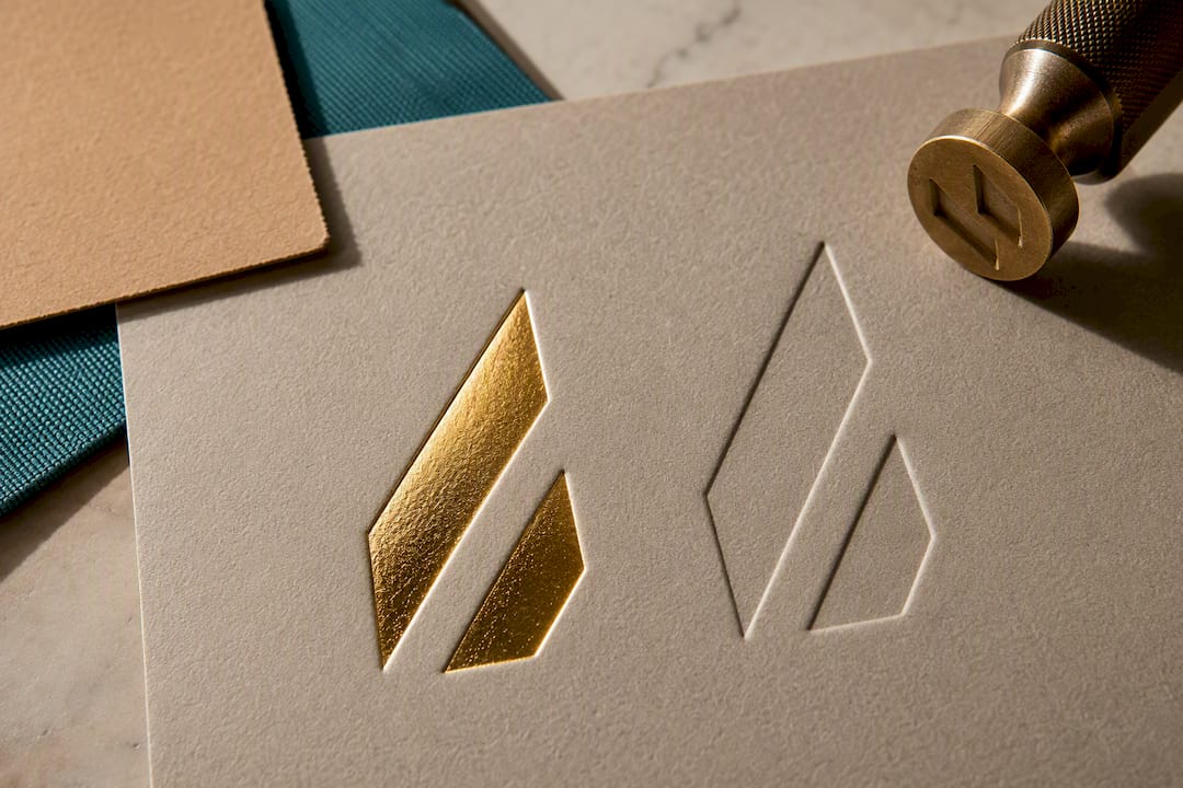
Hot foil stamping presses a thin metallic or pigmented film into the surface, giving logos a reflective, premium finish that photographs well for social unboxing content. Embossing raises the design above the surface; debossing presses it in. Both work without ink, relying purely on pressure and a metal die, which gives a tactile signal that reads as quality even before someone reads the logo. Spot UV adds a glossy raised layer over specific areas of an otherwise matte design, useful for making a logo pop without full foil cost. Digital print is the flexible, lower-setup option for shorter runs or personalised names.
Compatibility between finish and surface decides whether a technique actually works:
Foil stamping reads cleanly on matte or soft-touch laminated surfaces, but can look patchy on uncoated kraft
Blind debossing (no ink, just pressure) suits soft-touch and kraft surfaces particularly well, since the texture does the work
Spot UV needs a smooth, coated base to sit correctly. It rarely performs on raw kraft
Combining foil over a debossed logo creates a strong tactile and visual layer, though it adds setup time and cost
Every premium finish that uses a physical die (foil, emboss, deboss) requires tooling, and that tooling is a one-off setup cost that gets amortised across the print run, according to guidance on custom gift box finishing. That’s the practical reason small orders often stick to CMYK or digital print, while larger corporate runs can justify foil or deboss. Combining two finishes, such as foil over an embossed panel, is possible but doubles the tooling conversation with your supplier, and it is worth exploring the technical differences between these printing methods before finalising artwork.
What should go in your logo placement and artwork brief?
A supplier can only deliver what you specify precisely. Vague artwork briefs are the single most common cause of production delays and reprints.
Provide vector outlines, not flattened JPEGs or screenshots, so the logo scales cleanly to any panel size without pixelation.
Supply a PDF with Pantone swatches referenced by exact code, rather than relying on the supplier to guess your brand colour from a screen image.
State scale as a percentage of the lid panel width. A primary logo typically occupies a moderate proportion of the lid’s width, with secondary branding on side panels or interiors kept smaller to maintain hierarchy.
Confirm the dieline before finalising placement. Boxes fold and wrap in ways that flat mock-ups don’t show, and a logo positioned across a fold line or magnetic flap can distort or disappear.
Request a pre-production check with the manufacturer before bulk print begins, comparing your PDF brief against their proof.
Practical guidance for briefing a supplier consistently recommends this sequence: artwork review first, physical golden sample second, bulk production only once both are signed off, according to a brand manager’s guide to gift box branding. Skipping the golden sample to save a week rarely saves money once a full run comes back with the wrong Pantone match.
Pro Tip: Send your Pantone reference as a physical swatch book number where possible. Screen colours and printed ink can differ enough to matter, especially on kraft or uncoated stock.
How long do gift box orders take, and what are typical minimums?
Minimum order quantities scale with how much custom tooling a box needs. A simple folding carton with digital print might have a minimum in the low hundreds. A rigid box with foil stamping and a custom die usually needs a larger run to make that tooling cost worthwhile, since the setup is a fixed cost regardless of quantity.
Lead times split into two distinct phases, and treating them as one is a common planning mistake. Sample production, covering artwork proofing and a physical golden sample, typically takes one to two weeks depending on finish complexity. Bulk production, once the sample is approved, runs on a separate and usually longer schedule. Ordering both in sequence rather than in parallel protects you from approving a sample too late to hit a launch date.
The golden sample is worth treating as a formal checkpoint, not a courtesy step:
Colour match against your Pantone reference, checked in natural daylight, not just under office lighting
Finish fidelity, confirming foil, emboss or deboss reads exactly as briefed on the actual substrate
Structural fit, checking the lid closes properly and magnetic or drawer mechanisms work smoothly
Insert fit, making sure any tissue, card divider or product tray sits correctly without gaps
Photographic documentation of the approved sample, kept on file to compare against the first bulk shipment
Some tactile and metallic effects genuinely can’t be judged from a digital proof. A foil finish may look different when produced compared to on-screen proof, so suppliers recommend a physical sample step.
What should a supplier brief and question list include?
A tight brief protects your timeline as much as your budget. Before contacting a supplier, have these details ready:
Box dimensions and the product’s actual weight, since weight affects board thickness and structural requirements
Distribution channel, specifying whether boxes travel by courier, Royal Mail letterbox, or hand delivery
Finishes required, naming CMYK, Pantone, foil, emboss, deboss or spot UV explicitly
Colour specification, with Pantone codes attached rather than described in words
Quantity and delivery deadline, stated as a firm date, not “as soon as possible”
Once you have quotes coming back, ask suppliers directly about certifications (can they provide FSC documentation on request), quality control steps (what gets checked before shipping), sample policy (do they charge for a golden sample, and how long does it take), and transport packaging (how are finished boxes protected in transit).
Watch for a few warning signs. A supplier who won’t commit to producing a golden sample before bulk production is one to avoid outright. Vague answers about material specifications, or inconsistent claims about certification between emails and their own website, both suggest the quality control process is looser than it should be.
What does the evidence say about sustainable design trade-offs?
Applied research on packaging design gives a clear, evidence-based answer to a question buyers often assume has no good compromise: mono-material construction, reduced ink coverage and repurposable features can meaningfully lower environmental impact without hurting how consumers engage with the brand, according to a 2025 applied study on eco-design principles. In practice, that means a box built entirely from one recyclable material, rather than mixed board, plastic window and foil wrap, recycles far more easily at end of life.
Choose mono-material builds over mixed constructions wherever the format allows it
Cut ink coverage to the areas that need it, rather than full-bleed colour across every panel
Design in repurposable features, like a lid that doubles as a keepsake tray, which extends the box’s life beyond unboxing
Specify recycled board with FSC documentation as the default, not an upgrade
A practical example: a kraft box with a single deboss of the logo, no foil, no full-colour print, and an uncoated finish still reads as considered and premium, while being close to fully recyclable. The study’s own framing suggests minimalist design doesn’t cost brand recognition. It often sharpens it, because a restrained box stands out against the visual noise of over-decorated packaging.
What design principles actually make gift box branding work?
Good gift box branding starts with a clear sense of who opens the box. A box built for a client-facing luxury hamper needs a different weight of construction, colour palette and finish than one built for a bulk staff appreciation drop, even if the logo is identical.
Think about the recipient’s context, not just your brand guidelines in isolation. Employees receiving a wellbeing box at home respond to warmth and personal touches, so softer kraft tones and a handwritten-style card note out-perform a corporate colour block. Clients receiving a relationship gift respond better to restraint: a tightly controlled palette, one strong finish (foil or deboss, rarely both), and generous white or kraft space rather than a busy panel.
Consistency across touchpoints matters more than any single clever detail. If your primary brand colour is a specific teal, that teal needs to match across the box exterior, the tissue paper, and any interior card, using the same Pantone reference throughout. A mismatch between panels is one of the fastest ways to make a branded box look unfinished rather than premium.
Hierarchy also deserves real thought. The primary logo belongs on the lid or front panel at a scale that reads instantly. Secondary messaging, taglines, or a website address, belongs on a side panel or the interior, kept visually quieter so it supports rather than competes with the main brand mark.
How do you build brand storytelling into gift box design?
A branded box that only carries a logo is a missed opportunity. The strongest corporate gifting programmes use the box itself, and everything inside it, to tell a short, specific story about the brand or the moment being marked.
Start with the occasion. A box marking five years of service reads differently to one welcoming a new starter, even from the same company. A short printed note inside, referencing the specific milestone rather than generic thanks, does more for perceived thoughtfulness than any extra finish on the exterior.
Interior design carries as much storytelling weight as the outside. A printed insert card explaining why particular products were chosen, or a small illustrated map of where a hamper’s contents were sourced, turns a box of items into a coherent narrative rather than an assortment. This is where packaging becomes a genuine brand signal at the exact moment attention is highest, shaping how the whole gift feels before the recipient even reaches the contents.
Tone matters as much as content. A wellbeing-themed box benefits from calmer language and softer visual cues; a celebratory box can afford brighter colour and more playful copy. Keep the written voice consistent with how the brand talks everywhere else, so the box feels like an extension of the company rather than a one-off marketing exercise.
What actually drives the cost of gift box branding?
Four factors do most of the work in any gift box quote: format, tooling, materials, and volume. Rigid construction costs more than folding carton before a single finish is added, simply because of the extra board and assembly labour involved.
Tooling is the cost buyers most often underestimate. Any finish using a physical die, foil stamping, embossing, debossing, spot UV screens, carries a one-off setup charge that applies regardless of order size. That charge amortises down per unit as volume rises, which is why a 200-unit order with foil branding often costs noticeably more per box than a 2,000-unit order with the identical finish.
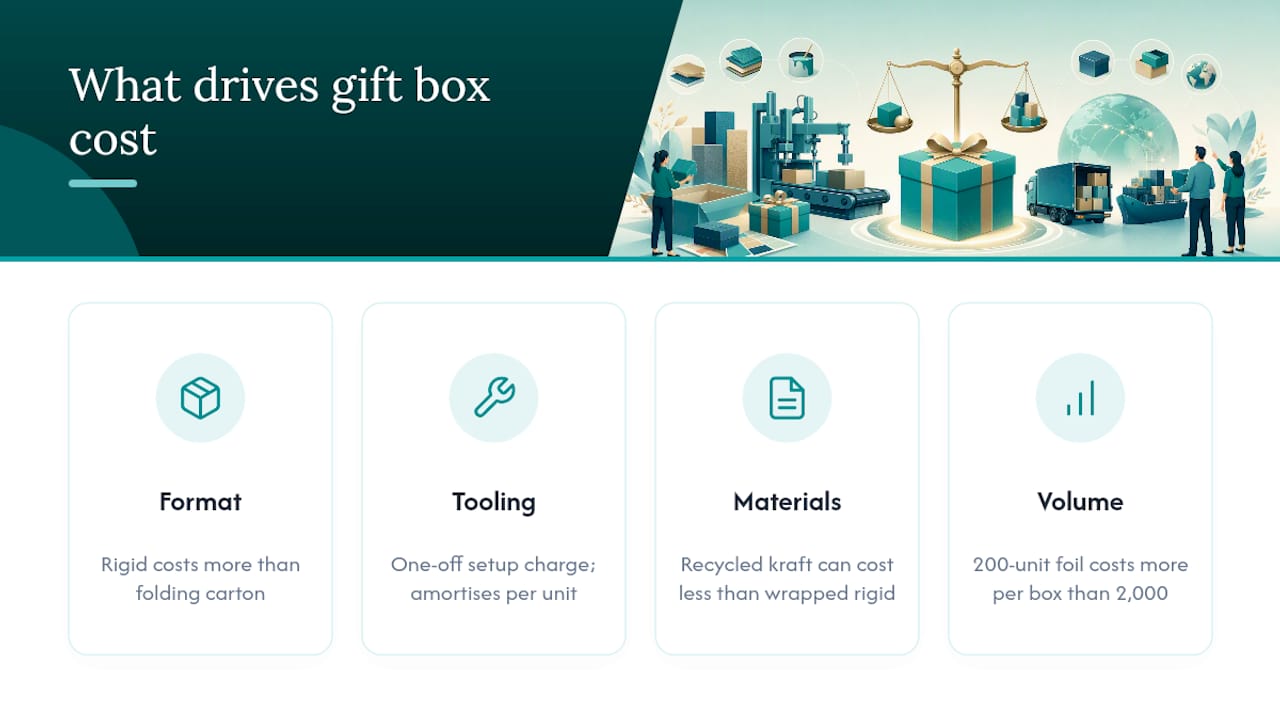
Material choice shifts cost in both directions. Recycled kraft can actually reduce cost compared with a fully wrapped rigid box, since it skips the printed wrap stage entirely. Specialist coverings like soft-touch lamination or textured papers push cost up.
Budgeting sensibly means separating these variables early rather than asking a supplier for “your cheapest option” and hoping it fits the brief. Decide which lever matters most, premium feel, sustainability credentials, or unit cost, and let that decision guide format and finish choices rather than working backwards from a single quote.
What mistakes derail most gift box branding projects?
The most expensive mistake is skipping the golden sample to save time. A digital proof cannot show how foil catches light or how a deboss feels under a thumb, and finding that out only once 2,000 units have shipped is a costly way to learn a lesson.
Vague artwork briefs cause almost as much friction. Sending a low-resolution logo screenshot instead of a vector file, or describing a brand colour as “our blue” instead of a Pantone code, forces the supplier to guess, and guesses rarely match what’s in a brand guideline document.
Ignoring dielines is another recurring problem. A logo positioned confidently in a flat mock-up can land across a fold, a magnetic flap, or a box seam once the piece is actually assembled, distorting the design in a way that only shows up on the physical sample.
Finally, treating sustainability claims as decoration rather than documentation causes real reputational risk. Printing “eco-friendly” on a box without FSC paperwork or a stated recycled content percentage invites exactly the kind of scrutiny that damages trust rather than building it.
Our approach at Say Hey Gifting: branded boxes without the guesswork
Corporate gifting briefs land on our desk in every shape, from a single client hamper to hundreds of employee gift boxes needed for a single rollout date. We work across custom branded boxes, build-your-own selections for teams who want flexibility, and letterbox gifts designed to travel safely through a standard UK letterbox rather than needing someone home to sign for a courier.
Every brief goes through the discipline this article has laid out: artwork checked against Pantone references before anything goes to print, a physical golden sample produced and approved before bulk production starts, and lower minimum order quantities kept available for teams running a first branded project rather than a full annual programme. That structure matters as much for a 50 unit welcome-box run as it does for a 2,000 unit staff campaign.
If you’re planning a branded rollout, our guide for HR managers walks through campaign planning in more detail, and the printing methods breakdown is worth reading alongside your supplier brief. For a sense of where design is heading this year, our trends piece covers what’s actually worth specifying now rather than what looks good in a mood board.
— Craig
How Say Hey Gifting turns a branding brief into a finished box
We build custom branded corporate gift boxes, employee gift programmes and letterbox solutions specifically for teams who need reliable output without managing a print supplier relationship from scratch. Whether the brief is a one-off client hamper or a staff-wide rollout, the process runs the same way: you share your brand assets and quantities, a golden sample is produced for approval, and only once that sample is signed off does bulk production begin, followed by delivery on the schedule set.
If tactile finishes like foil or deboss matter to your brand, or you need a mix of formats across departments, whichever presentation carries the least handling risk for your team, our custom gift box service for corporate gifting is built around exactly that flexibility. For HR teams focused specifically on staff recognition, the employee gift boxes and staff gifts page is the fastest way to see current options and get a project moving.
Start by outlining your quantities and finish preferences, and request a sample.
Sources
For deeper detail on the packaging science behind these recommendations, the 2025 applied study on eco-design principles and analysis of UK sustainable packaging trends cover the sustainability claims in this article in more depth. For finishing compatibility on luxury textiles, CXL by Christian Lacroix Maison’s packaging guide offers useful comparative background.
FAQ
What is gift box branding?
Gift box branding is the combination of construction format, material substrate and finishing technique, such as foil, emboss or Pantone print, that shapes how a brand is perceived when a recipient opens the box.
What is a golden sample and why does it matter?
A golden sample is a physical pre-production sample approved before bulk manufacturing begins, and it’s the only reliable way to confirm tactile finishes like foil or embossing that don’t display accurately on a digital proof.
Should I use Pantone or CMYK for my logo?
Use Pantone spot colour when exact, consistent brand colour matters most, and CMYK full-colour print when the artwork includes photography or complex gradients that spot colour can’t reproduce.
How do I know if a supplier’s sustainability claims are credible?
Ask for FSC chain-of-custody documentation, a stated recycled content percentage, and confirmation of water or soy-based inks rather than accepting a general “eco-friendly” label at face value.
Does Say Hey Gifting offer low minimum order quantities?
Custom branded runs are supported alongside larger corporate programmes, including build-your-own options for teams testing a first branded project before scaling up.
Recommended

Comments